Redesign
Short-form vs long-form posts
I’ve been writing a lot more lately—especially short-form “updates” rather than long-form blog posts—so I felt compelled to update the blog index’s design to distinguish between the two. Giving a 1-paragraph post the same weight as a lengthy case study didn’t sit well with me.
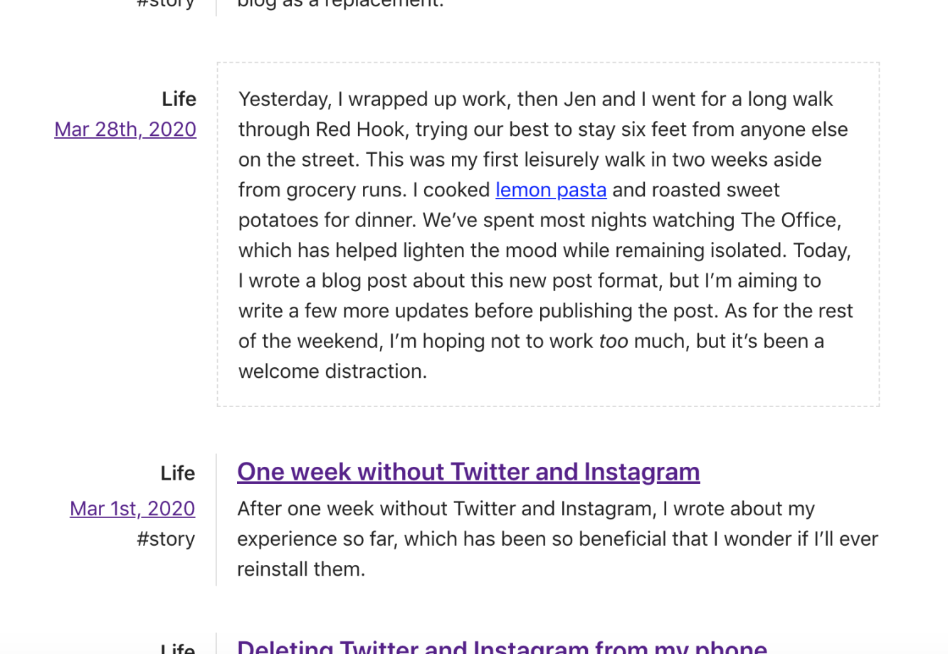
At first, I thought of including the shorter updates inline, so you could simply read them rather than needing to click into one only to find that it’s as long as the description. That immediately backfired as my updates inevitably became longer, which led to long-form posts being overshadowed by the updates.
I took a step back and decided that even if an update could end up being the length of a thoughtfully-written and edited article, I could differentiate it and reduce its significance by leaving out the description. The entry would appear simply as a linked title. This saved me from needing to write descriptions for updates, but I’d still need to come up with a title, which, I think, is a fair compromise. Including a title lets me avoid hitting rock bottom and using timestamp-based slugs for the posts—yuck.
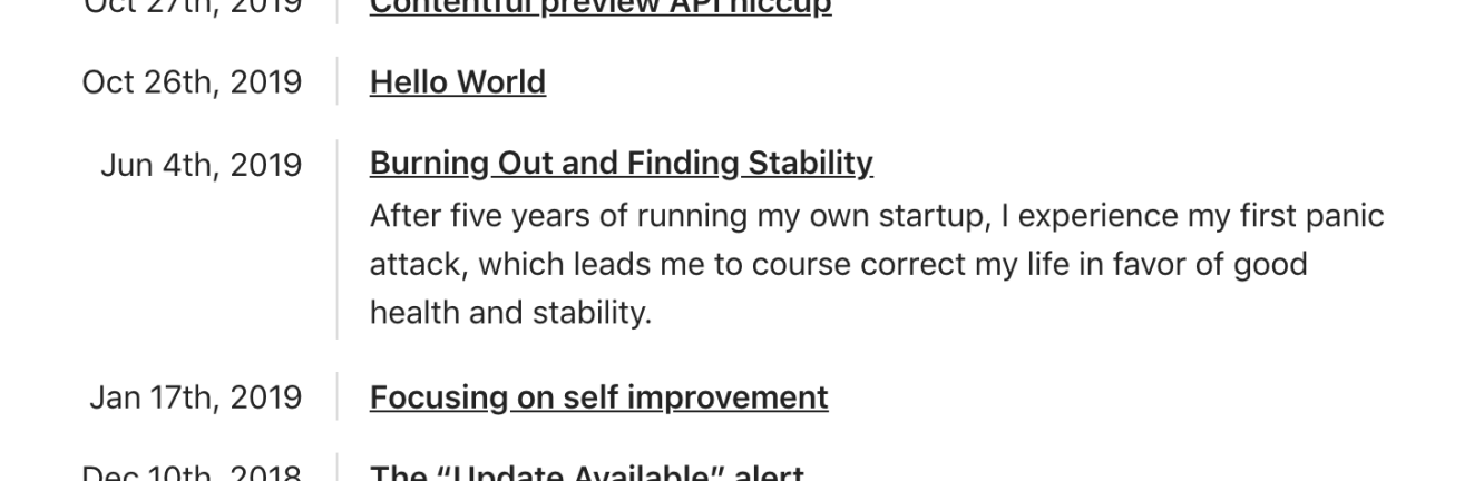
After hiding all the existing descriptions for my redesign updates, and not adding new ones for all my recent “life” updates, the long-form posts did stand out more, but they still needed a better sense of hierarchy. The index felt flat with every bit of text sharing the same font size, so I took this opportunity to bump up title size of the long-form posts.
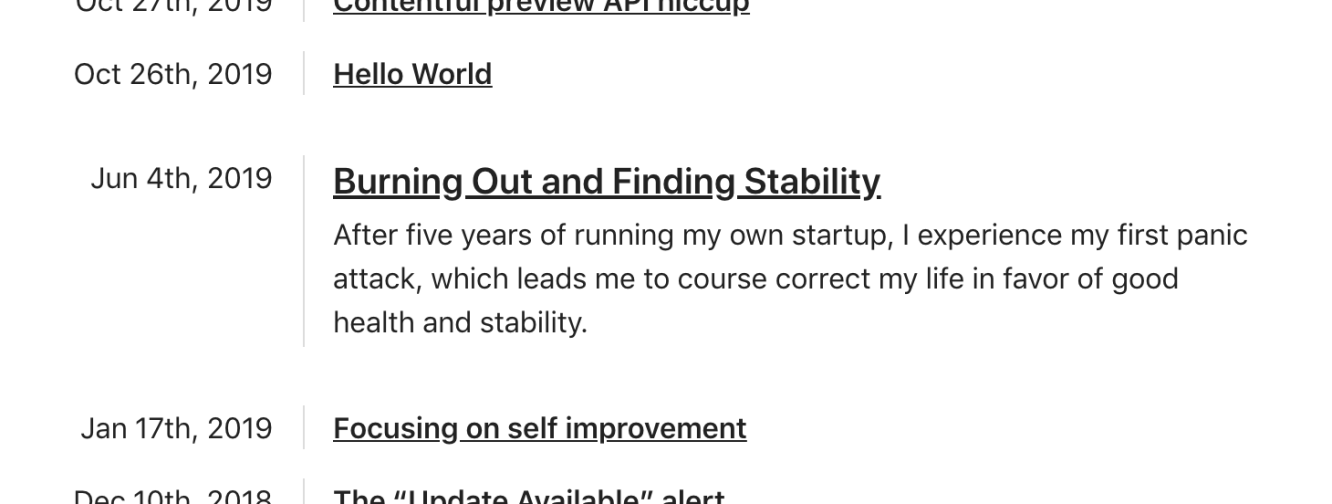
This instantly made a world of difference and also helped emphasize the title over the description. I also increased the margin around the long-form posts, so they’d really stand out on their own. I was happy with where this was going, but the lack of color made the page feel cold.
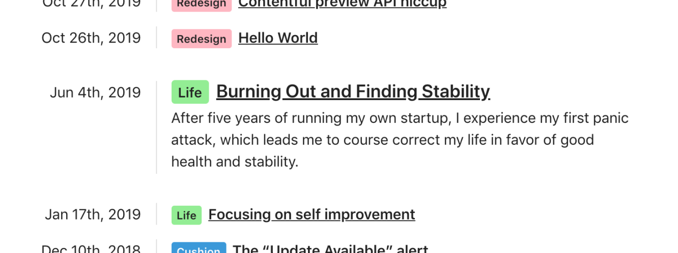
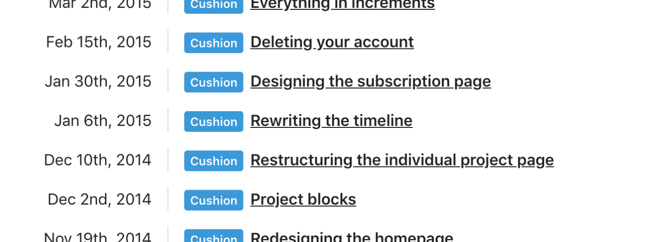
Since each blog post, whether an update or a long-form post, included a “category”, I took this opportunity to add it as a badge-like element. I also colored the categories to give the page more life. Determined to continue using named css colors, I took a stroll down the “pale” aisle for a friendly set of colors that aren’t too harsh, nor too light.

I also included these category badges on the individual post pages. I don’t use em’s too much, but this is one occasion where they really worked out well. I don’t plan to have too many categories, but the groupings of color on the blog index really gives you a sense of phases of my writing life.
With this new design, I somehow felt more proud of my writing. I wanted to write more, or at least show more of my writing on this fresh-feeling blog index. In fact, most of my writing wasn’t even on my blog—it was on the Cushion journal. I could hear it call for me to include those posts here, too. As my body of writing has grown to include several facets of my life, it only makes sense to include the five years where I similarly wrote about building Cushion. I realized I would need to migrate every post, which wasn’t going to be an easy task, but needed to be done.
Rather than spending hours writing a migration script that converted all the markdown to Contentful rich text and copied all the S3 images to content models, I spent several hours (across several sittings) manually copying each post into Contentful. Literally command+c’ing from the journal’s page luckily maintained all the styling and linking, and Contentful’s drag & drop images let me drag directly from the journal’s page, too. Despite the countless hours to move everything over, I feel almost relieved to have all my writing in one place. It truly inspires me to write even more.